How I Teach Material 3
As of Google I/O 2024, it’s been three years that I’ve been talking about Material 3. As the spec has evolved, the way that I teach it has evolved too. For a while, I’ve been mulling a post noting the fundamentals I wish I’d focused on when we first released it. The content that follows is what I think is the best, or at least a good way, to explain Material 3 and its intricacies to designers and devs alike. Thanks to y’all who unknowingly helped me refine it.
My method sort of banks on a couple of rules that underpin Material 3 as a design system. Don’t click away. Yes, I’m talking about this Material with forty plus colors in a scheme and explaining it with a couple rules. Bear with me.
Light Theme

Dark Theme

The rules
The core concepts I’ve come up with are all interconnected. Each more or less builds on the one before it.
-
A key color is used to create other colors or derive an entire theme.
-
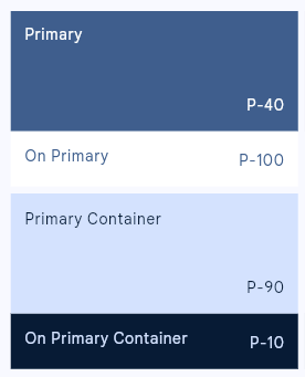
For every named color, there is a complementary named color that is guaranteed to have proper contrast when you use the two together.
-
A color family is a set of colors related to a key color providing variety and required contrast. Color families are two or more iterations of the preceding rule.
-
A theme is composed of a number of color families.
Common Mistakes / Misconceptions
Despite the advice that Material 2 is very very very different from Material 3, there are several reasonable mistakes and assumptions that a lot of people make.
-
Mistake #1: Believing the role of the primary color in Material 2 is the same as primary in Material 3.
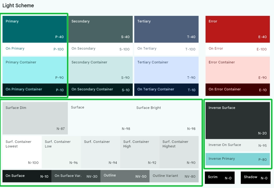
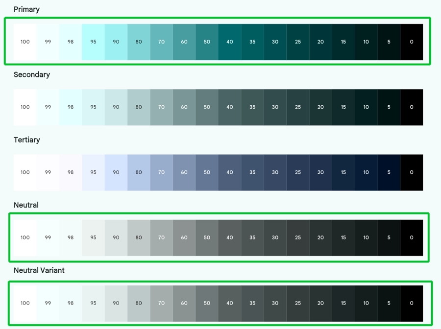
In Material 3, the primary color impacts more than just its own color family. Surface colors that may appear to be solely gray and black tones are actually tinted with the primary color. The circled roles and palettes are affected by primary. Secondary and Tertiary colors are also derived from the primary’s position in the HCT color space but the impact is more limited as it is more common to change them. It also bears noting that the key colors for neutral and neutral variant can be changed as well however it might be less obvious to do so.
-
Mistake #2: Using your brand color as the primary color.
Because so much is derived from primary, using a bold color for primary will make your theme awash in that color. That’s a big problem if your design system wants you to build from white.
-
Mistake #3: Having a color system half in Material and half outside it.
It’s pretty common to need more colors than what Material provides. These often come in pairs that might align in function with color families. In the best case, you may have parts of your app that have inconsistent color or contrast. In the worst case, content may become illegible if the container colors shift too much based on user preferences.
A common mistake is for a developer to manually change say a surface color or background of a component without taking the
onSurface\on<ColorRole>color into account.I’ve also seen third-party implementations of Material themes that often seize on certain aspects of the system and ignoring others. I’ve seen my fill of "normal theme but adds pastel colors" takes on Material.
Tooling
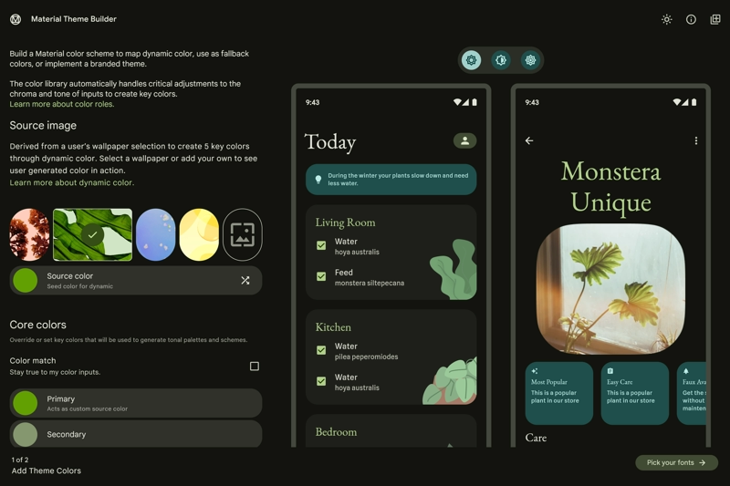
The added complexity to create a theme is lessened somewhat by Material Theme Builder. It helps you create theming code in Android Views, Compose, Flutter, and Web. It’s coming to its third anniversary. Use it.
Future considerations
There are a couple things that aren’t on folks' radars that I think should be, namely color match, contrast, and extended color. If you are just now coming to Material 3, I’d encourage looking into them from day 1.
Color Match
In brief, color match slots a color very close to your input color into a theme versus shifting it as the default algorithm does. There are additional implications like what to do in dark mode but the "I put in black and it made it red or blue" problem can be mitigated.
The feature was released in the sort of quiet zone just before the holidays last year so don’t feel bad if you didn’t hear about it. I’ll be discussing it in detail in a future post.
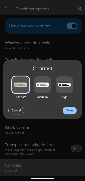
Consider Adopting Contrast
Android 15 will have a contrast control. It’s currently in Developer Options, final location and UX to be determined. The user will be able to select between three levels of contrast: standard, medium, and high. Current themes will slot into standard.
If you are using dynamic color, the shifts in contrast will take place automatically at the system level. You will have to handle any custom/static themes and colors on your own. The current version of Material Theme Builder does export theming code for light and dark for all contrast modes.
I’ve updated Reply in android/compose-samples with helper code to demonstrate selecting the proper colors for a given contrast level.
Consider Using Extended Color
Extended color is a part of the Material spec that gives you a place to create additional color families to include with your theme. Material Theme Builder will make sure these colors align to the spec and package them up, leaving the last mile of implementation to you (likely a CompositionLocal on Compose or a ThemeExtension on Flutter).
This is one of those things that is easier to digest with an example so stay tuned.
Hopefully after reading this, you have a bit more insight into how Material 3 works and no longer see it as a wall of random colors.